Not everything has to match when it comes to great interior design. In fact, mixing colors, patterns, metals, and woods is a fantastic way to add character and visual interest to any room. A little prudence and planning can go a long way when it comes to achieving the mood and depth that your space has been lacking. It’s all about color, scale, tone, and texture.
Tips for Mixing Colors
- Define how you want to use the space first. Monochromatic and analogous color palettes work well for peaceful areas, while triadic and complementary schemes work well in livelier environments.
- A monochromatic palette consists of just one color, varying from light to dark.
- An analogous palette consists of two to six colors right next to each other on the color wheel.
- A triadic palette consists of three colors that are perfectly spaced on the color wheel to form a triangle. The scheme is bolder, but also well-balanced.
- A complementary palette consists of two colors that are directly opposite of each other on the color wheel.
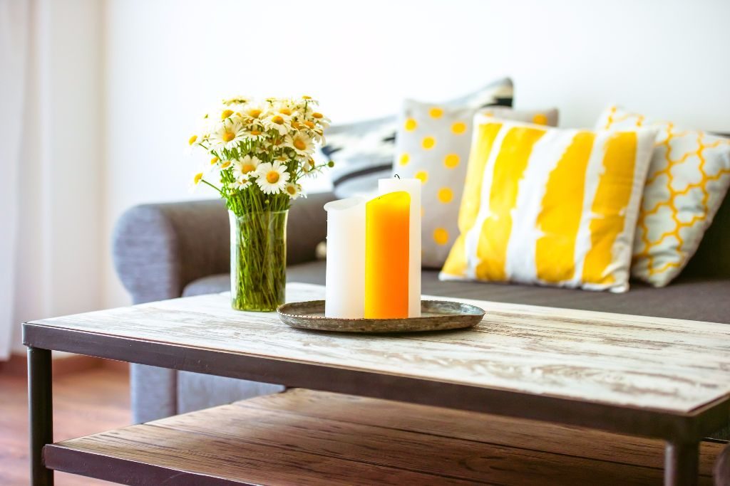
- Determine if you want to go warm or cool. Warm hues like yellow, orange, and red are energetic and dynamic. Cool tones, like blue and green, are calming and soothing.
- Consider the room’s details and lighting. Are there any elegant architectural accents or focal points that require attention first?
- Bright, bold colors will leave you feeling exhausted over time. Make sure to maintain a balance between bold and soft. A good rule of thumb is the 60-30-10 principle.
- Keep 60-percent of a room just one color from your palette. It is easiest to devote this percentage to your wall color.
- Furniture and cabinetry make up the secondary color, totaling 30-percent of your design.
- The last 10-percent includes accents like artwork and plants.
- Go with your gut. If you immediately hate a color combination, there’s a good chance that it will never grow on you. Choose what speaks to your personality and personal preferences.
Tips for Mixing Patterns
- Choose one dominant pattern and make it the largest pattern, scale-wise.
- The second – or medium – pattern should be half the scale of the primary one, but with similar colors.
- The third – or smallest – pattern should be even smaller in scale, and could even be similar to another pattern used. Again, the colors should be in the same palette.
- Implement an odd number of patterns. Just like in other areas of interior design, odd numbers work well.
- Pick one primary color scheme with one accent color for some “pop.”
- Remember that small, geometric patterns with texture can serve as beautiful neutrals. Polka dots can also be considered as a neutral, depending on the color and scale.
- Select only one busy print. Two bold patterns will fight with each other and make an area too noisy.
- Soften patterns with solids. Accent wallpaper with a strong pattern demands a solid couch, and vice versa.
Tips for Mixing Metals
- Contemplate your room and the colors you’ve chosen. Mixing metals doesn’t have to be defined by just lighting fixtures and hardware; think about frames, textiles, and artwork as ways to bring a little metallic flourish into your space.
- Appoint one dominant metal for the room that marries with your color palette, and then select one or two more for contrast. Warm metals balance cool ones to provide pizzazz and harmony.
- Warm metals like gold, brass, and copper tend to partner well with warm colors.
- Cool metals like silver and chrome pair well with cool hues.
- Utilize iron as a solid neutral for any room.
- Remember that textures – like matte, shiny, and hammered – are another way to mix your metals. Limit yourself to three, though, so that they don’t become overwhelming.
- Keep it simple: you don’t want anything competing for attention.
Tips for Mixing Woods
- Avoid using the same wood tone on floors, cabinets, and furniture.
- Elect a dominant wood and then keep it to the 80-20 rule. 80-percent of the room should be the first wood tone you have chosen, while the other 20-percent should consist of two or three other tones.
- Anchor the room with a focal piece and then design around it.
- Ensure repetition. Even though 20-percent isn’t much, make sure that the tones are repeated in several places around the room.
- Look at undertones when “matching” wood. Woods with warm undertones go well with each other, just like woods with cool undertones do.
- Using consistent grain textures can tie wood together. If all the woods have pronounced grains, they will feel rustic and primitive. If they all have fine grains, they will seem more formal and polished.
- On the flip side, contrasting wood textures is a great way to mix it up, too.
- Buffer tables from wood floors using rugs. The small separation will pull woods together that may look funny right next to each other.
- Calm any space by mixing in some white.
- Balance wood tones with wall colors and textiles.
Spice up your space by combining a variety of colors, patterns, metals, and woods. Start by choosing your dominant elements, and then mix in accents from there. Incorporating different hues, finishes, and textures will set the attitude and style of your home. Have some fun with it, and don’t be afraid to mix it up!