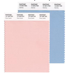
Looking for inspiring decorating ideas? Get started with Pantone’s 2016 Colors of the Year – Rose Quartz and Serenity. Whether you want to update your overall interior design or simply add new touches, you’ll love the versatility of this year’s selection.
 Pantone surprised us all by going with a pair of colors rather than a single this year. In their words, “Joined together, Rose Quartz and Serenity demonstrate an inherent balance between a warmer embracing rose tone and the cooler tranquil blue, reflecting connection and wellness as well as a soothing sense of order and peace.”
These soft hues easily blend with your existing decor, contrasting against dark, earthy shades or gently brightening neutrals.
Repaint walls and cabinets for a big change.
Rose Quartz and Serenity look great on walls or cabinets. They’re soft enough to fit in any room, and they steer clear of stereotypical pink and baby blue, so they add a sophisticated element to your palette.
You can refresh a room with your favorite of the pair or use them in combination. Paint walls in one of the colors and cabinets in the other. Paint two neighboring walls in one of each. Or go for a floral wallpaper incorporating both.
If you’re not ready to repaint, look for architectural elements to play with. For example, add a new backsplash around sinks. Or paint just the door to create an unusual twist.
Recover upholstered pieces for a surprising change.
Give tired furniture new life with custom upholstery that incorporates Rose Quartz and Serenity with other pastels. Check out Smith Brothers of Berne for inspiration. Look for fabrics with complementary hues like Lupine, Opal Blue, or Luminary Green.
For bedrooms, add an upholstered chair or blanket chest to mix in fresh color. Work with your interior decorator to select which pieces to change and which to keep. These tones are so mellow that you have a wide range of options for blending them in.
Show off the new tones with mix and match fabrics, rugs, and linens.
You can easily enjoy this year’s trends by bringing in new bed linens, rugs, and decorative textiles. When you’re working with accent pieces, you can go a little bolder. Pair pastels with earthy greens and reds like Silver Grey, Thyme, and Fig.
Here’s your chance to play with texture, as well. Mix voluminous window treatments of raw silk with cozy angora wool afghans or velvety throw pillows. Or look for area rugs in everything from tight, flat weaves to luxurious faux fur. See Capel Rug’s Crystal Falls style in H2O Blue or Dash & Albert’s nubby florals for ideas.
Highlight new colors with unforgettable accessories.
A small change makes a big difference if you’re showing off these new hues with a standout accessory, like an unusual lamp, artwork, or vases. See Chelsea House lamps for a great variety in the latest finishes. Look for pieces that combine Rose Quartz and Serenity with muted warm tones like Cream Gold and Starfish.
Accessories give you the option of adding in some metallic accents or opalescence for added dimension. And don’t forget the kitchen. These colors look great in dishware, serving pieces, or tinted glassware. You can even find appliances like mixers and toasters finished in the 2016 tones.
Let nature help with your interior design.
The Pantone picks make us think of spring flowers, cherry blossoms, hydrangeas, and roses. Fresh flowers brighten any room, or you can bring in dried versions that last longer. Show them off with vases of tone-on-tone peaches and blues like Blooming Dahlia or Arctic.
Or put your favorite houseplants in pots incorporating the new colors. They will contrast with the natural greens and give you a chance to display your favorite artisan pottery.
Pantone has given interior designers a lot to experiment with this year. It’s an invitation to explore the interplay between pigments, textures, and styles and to find balance among the contrasts. If you’d like to see how Rose Quartz and Serenity could work in your home décor, call us for a free consultation.
